Post #8: And so it ends…

This semester has been a wild ride. From learning about propaganda to creating our own virtual museum, I’ve definitely learned a lot about the power of visuals and how different types can communicate different things. By representing ideas graphically, through typeface, through photography, etc., I am now aware of how to use them more efficiently and better convey meaning. Visuals aren’t just pretty images, they’re part of how we learn about and navigate our world. From now on, I hope that I won’t just passively take in all the visuals in our world but instead see the work that goes into them and the message they’re conveying.

These weekly blogs have also been a great help in my reflection on the material we’ve learned. I think my favorite topic was the first one about language as a visual way of communicating because it helped me realize that communication isn’t only about what you hear, it’s also about what you see. The topic that I could relate to the most was the one about photography and comics because I really enjoy both of them! I personally am more of a creative person so all that we learned this semester really allowed me to let loose my creativity by using blogs as an outlet.

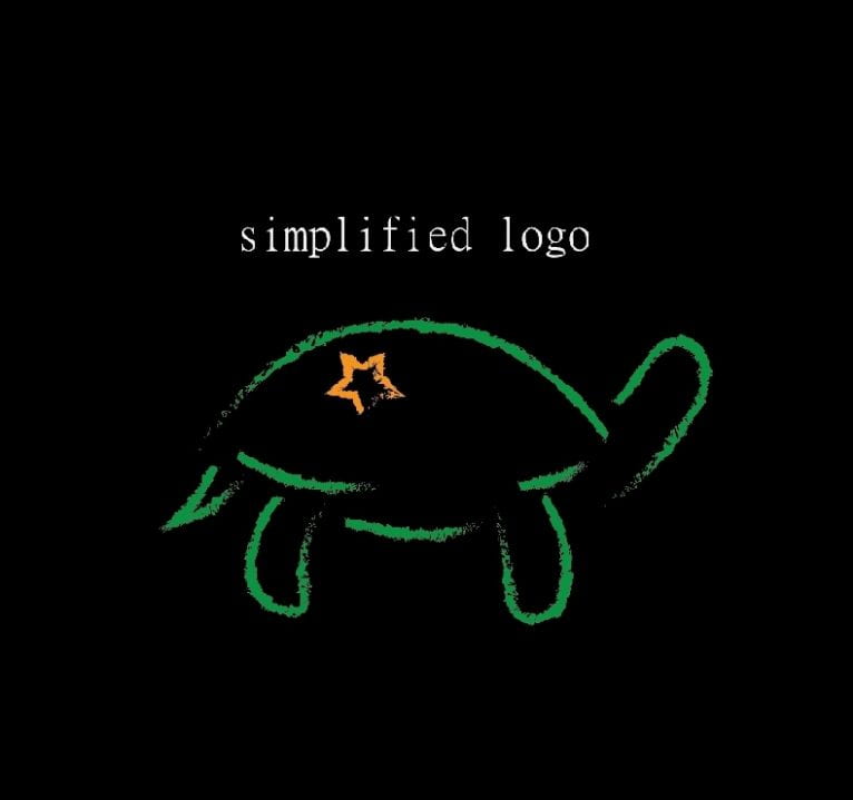
Speaking of creativity, the two mediums that I’ve been often using in my past posts are my own work from my graphic design and photography classes. Perhaps that’s why I feel such a connection with visual communication⁠—a lot of things that I enjoy are very visual! As a communication major and creative writing minor, the joy I get from stories and deeper meanings is like no other. So I’m curious, considering all that I’ve described about myself, what kind of person do you think am I? As consistent with my past blogs, I’ll end this one by including a visual representation of myself that I created, while also circling back to the very first assignment we had where we introduced ourselves!

Visual representation of myself in my personal space using only 4 colors (2021)

What kind of emotions does this make you feel (if any)? What do the visuals in this tell you about how I see myself? This visual representation of myself is also what I hope to be when this semester is finally over⁠—calm!

Post#7: The Pandemic Through the Lens of Visuals

During these many months of living in a COVID stricken world, it has become more important than ever to make sure the public understands the severity of the situation we’re in. And one way that this has been done is through the use of visual communication, particularly posters, that both educate and urge people to take action.

A good visual is one that effectively conveys a message. Some ways to do that are by “showing rather than telling”, focusing on what’s important, being visually effective (simple, easy to read, organized, etc.), and/or telling a story. Visualizing health is important because its purpose is to reach the most people possible with the most impact on their behaviors. This is especially crucial during these dangerous times where adhering to public health practices will save more lives and eventually stop this worldwide lockdown faster.

Currently, I am taking a photography class where we take black and white photographs. One of the first assignments we had was to take pictures of a list of things, and one of those prompts was “An example of a COVID world.” I ended up taking four pictures of different visuals used at a local library, a Target, and at Brooklyn College. Take a look at the images below and see which one(s) you believe is most effective or that you just like better.

A sticker on the floor of a library (2021). It reads “6 ft”.
A sticker on the floor of a Target (2021). It reads: “Please help everyone by keeping a distance of 6 feet” and “Thank you for practicing social distancing”
A poster on a wall of Brooklyn College (2021). It reads: “Wearing is caring”
A poster in a bathroom of Brooklyn College (2021). It reads: “Safe today. Healthy tomorrow.” and “Due to social distancing requirements this facility is temporarily closed. We apologize for the inconvenience.”

The visuals I included above range from having no words to having many words. Is one more effective than another? Why? Is it better to have only pictures, only words, or perhaps a mix of both? The one that intrigued me the most was the last photo that I took in a bathroom at Brooklyn College because not only was it acting as a public safety announcement, but it also acted as a physical safety measure that prevented me from using that particular sink. If you look closer at the top edges of the photo, the the reflection shows that the two sinks on either side are open for use; this means that you are forced to social distance even when washing your hands in the bathroom.

Overall, during these times when posters, stickers, ads, etc. are everywhere around us, they have become intimately intertwined in the public spaces that we interact in and serve as a constant reminder of the situation we’re living in. Though some choose to pretend that the pandemic doesn’t exist and ignore safety measures, these visuals that are in every public space and should be taken seriously.

Post#6: Propaganda in a COVID-19 World

When people hear the word “propaganda,” they usually have negative connotations of its meaning or purpose. By definition, it is a form of persuasion (ex. using a poster, ad, video, etc.) that relies on techniques like appealing to one’s emotions in order to used to further an agenda. So while propaganda isn’t inherently a bad thing, people often associate it with manipulative, misleading, or controversial ideas. However, there are some examples of propaganda actually representing or promoting good things. For example, the famous stylized Barack Obama poster showing his portrait in patriotic colors and the word “HOPE” beneath it. For many, it became an icon for his campaign.

Interestingly, I used to take a digital art class and one of the assignments was to make a propaganda poster using Adobe Illustrator, but it had to be positive. The professor called it “PROpaganda” which I thought was clever. For my assignment, I combined three different ideas: the “Be like Bob” meme, my previous experience in fencing, and the current situation at the time during the start of the pandemic. My purpose was to promote the idea that people should practice safe actions like wearing masks, washing hands, staying six feet apart, etc. What do you think of my poster?

Be Like a Fencer – Janice Zeng (2021)

To explain the content of the poster, the fencer in green is chasing away the person in red. The caption is telling the audience to be like the fencer. Why? Well the fencer wears a mask, gloves, and stays (way over) six feet away from their opponent. The fencer is also chasing the other person away to those objects with their blade. Why do I not condone physically threatening people, the visual gives the viewer a sense that it’s very important to wear protection and practice safe distancing. To me, the poster serves both as a fun and a good reminder for everyone to be safe during this pandemic.

So are all propaganda posters bad? Obviously not. But that doesn’t mean that viewers should just go around trusting everything they read online. Viewers need to hone their media literacy skills in order to learn how to discern what’s good and accurate from the bad and misleading.

Post #5: Navigating Your World

In Lotfi Merabet’s TEDx Talk called, Blindness is just another way of seeing, he asks his audience to first imagine how they feel when they see a blind person at a crosswalk. They might answer saying things like pity, indifference, or worry. Then he asks them to imagine the scenario if they were the one who was blind. Suddenly, the audience might feel scared or that they’re missing something and thus are unable to function. What about you? What are the emotions you would feel? The full video is attached below.

For me, I definitely panicked a little when I imagined myself suddenly losing my vision and being unable to navigate the way I used to. After all, I can barely navigate well even with my vision now! I have a horrible sense of direction, almost never wear my glasses outside (so my vision is unreliable), and I tend to tune out noises a lot when walking. Clearly, I am not one who is aware of her surroundings and this could be quite dangerous especially in busier streets.

When considering how I normally travel from one place to another, unless I have done it multiple times and know exactly what to expect, I still resort to using my Google Maps app on my phone. It’s quite handy because not only am I able to see what routes are available, I can also see how much estimated time it would take me and all the places/streets in the area so I know where I’m going. Though the tracking is a bit off on my phone and it doesn’t usually point me in the right direction, the outline path is still quite helpful so I just follow that instead. It has gotten to the point where the app is something I use weekly, even for places I generally know how to get to. I like the ease of the app because knowing how long a trip would take me in addition to all the possible methods of getting there brings me great comfort.

So how would someone who is blind possibly use the app? Though I don’t personally use it, I know that there’s detailed voice guidance built into it! And something interesting that I’ve noticed when using the app is that it also buzzes when you’re about to make a turn! So if you’re walking straight and the app tells you that you have 100ft left before the next time, the app actually vibrates when you need to turn. This is helpful when I don’t want to constantly be looking down at my phone when walking. Overall, the app is a lifesaver both in terms of navigation and mapping.

Post #4: Thoughts on CASD 1643 so far…

Considering all the topics we’ve learned so far in this class, I’ve definitely been made more aware of the forms of visual communication around us and how much work goes into it! I’ve always considered communication to be very important but the topics we covered made me realize how communication isn’t always verbal and that visual communication is just as important. We’ve covered topics like language, comics, photography, typography, visual accessibility, and museums—all of which the average consumer often doesn’t give a second thought to. I enjoyed each topic because I always found something to relate to or learned some new that would impact how it I see things from now on.

I’ve always been a fan of creative writing so things like metaphors, antithesis, etc. tickle my brain. I especially enjoyed the assignment where we had to create a poster for a medium like a book or movie. It felt nice to break out my Adobe Illustrator app once more to turn one of my favorite childhood books into a new poster.

Although I don’t read American comics (I have watched some of the movies though), I do often read Korean, Chinese, or Japanese comics which are called “manhwa,” “manhua,” and “manga” respectively. Manhwas and manhuas are colored while manga is monochrome, but what’s interesting about the former is that they are read in “chapters” where one chapter is actually a long strip that you read continuously by scrolling down. So when we learned about the work that goes into producing a comic, I had a newfound appreciation for all the work that goes into making them.

As I mentioned in one of my previous blogs, I am currently taking an introduction to photography class and so it’s definitely been a learning curve for me. Especially since we are only allowed to take photos in black and white, I’ve adapted to trying to capture a photo that conveys emotion even without color. Two of my favorite photos that I took recently are shown below. What feelings do you get from them?

A helicopter casually passing by – Janice Zeng (2021)
A man on a mission – Janice Zeng (2021)

When considering typography, it’s also important to consider the accessibility of them. So not only should it look good, it should get its meaning across efficiently and to all. This was something I often glossed over because I never thought about how someone has to purposely choose a font to best convey their text nor did I think about how it’s not always viewed the same by everyone.

Lastly, I also have a newfound appreciation for museums! The MET has always been one of my favorite museums to go to and I’d been to the Museum of Natural History most recently so I do quite enjoy going to them for fun. And every time I go, there’s always a new section to explore which often made me wonder about the huge amount of time, effort, and skill that went into putting it together. The next time I go to a museum, I’ll definitely consider not only the content of the exhibits, but what are the factors that went into giving me the experience.

In the next topics we learn about in this class, I have no doubt that I’ll continue to learn more about things that will expand my horizons. By taking a look at the course outline provided, I can see that one of the topics we’ll be covering is propaganda which is exciting to me because in my previous digital art class, we had to make our own propaganda posters and it was something that I didn’t really get the hang of. Overall, I can’t wait to see what we’ll be learning about next!

Post #3: What logos stick with you?

It’s always interesting to see how many logos have evolved over the past years into something more minimalistic, sleek, and eye-catching. Brands have mastered the art of picking the right colors, font, symbols, and other design elements to make their logo both representative of their brand and memorable.

When I think of effective shopping logos, I think of ones like Target, McDonald’s, and Coca-Cola. It’s also interesting to note that these three logos are associated with the color red, as well as hundreds of other well known logos. Why is that? Well, the color red is easily one of the more visible and eye-catching colors. Its vibrancy insinuates many things like urgency, passion, and power—all of which makes the brand seem more accessible and desirable to the consumer. And as previously mentioned, the simplicity of these logos make them easily digestible so that people will easily recall them and thus feel more familiar with them.

Honing in further on the typography aspect, the three examples of logos I gave above have their own reasons for being so iconic. When it comes to Target, it’s interesting how though the logo is usually accompanied by the word TARGET all in caps, I feel like most people skip over that part and just see the symbol of circles that form a target. When it comes to McDonald’s, once again the words are generally glossed over and it’s the yellow arches that form an M that remains in people’s minds. But McDonald’s is also clever in this way because as simple as their M logo is, it still retains part of its name as opposed to the Target logo which is representatively similar to its name. On the other hand, the Coca-Cola logo’s typography is neither short nor iconic. In this case, the flourishes of the font do all the talking and so the name itself is what’s memorable.

I’ve also tried my hand at designing a logo for my digital art class that I took last semester. We were just beginning to learn how to use Illustrator and our first assignment was to create a logo representative of ourselves. For me, I’ve always considered myself a very lethargic person and so I made that my logo. When I think of lethargy, I think of sluggishness and that’s how I thought of the idea to use a turtle as my icon. One thing led to another and I ended up creating a beach scene where I hoped that a sense of chillness or calm would come across.

Full Logo (2021)
Simplified Version

What does this logo make you think of me? How does the choice of font impact what is conveyed? Is the simplified version better, and if so, why? Does the lack of words in the simplified version make it more digestible? Which do you prefer?

Post #2: What goes into creating a photograph?

There seem to be some people out there who believe that photography is as simple as snapping a few photos, throwing a filter on it, and then calling it a day. But if it’s really that easy to take a “good” photograph, then why aren’t there more people out there taking photos and making money off of them? That’s because photography is a form of art—and art takes a lot of skill, time, and effort. It’s one thing to take a random photo with little to no consideration and it’s another to take a photo with a purpose and intent behind it. Obviously not all good photos have to have a whole production team behind it, but when one takes the time to create a photo with meaning or one that tells a story, that makes all the difference.

Coincidentally, this semester I am taking an introduction to photography class where we mostly work with just monochrome (black and white) photos so I’ve come to appreciate the art of capturing an image without color. At first, it felt like a limitation to me because I love seeing the vibrant color of flowers and other things in photography, but after taking a 1000 photos in just 3 weeks, I’ve realized that sometimes the pictures are more powerful when taken in just monochrome. While looking at the Birmingham protests photos in class, I felt that the black and white aspect worked well because it added to the seriousness of the events captured. Though color photography had been invented in the 1840s, it didn’t overtake black and white photography until the 1970s and that was a very intriguing thing that made me wonder why that was the case.

Anyway, I digress. I truly believe the phrase that a picture speaks a thousand words, but I also know that those words or stories mean something different to every person. Two people will not interpret a photo exactly the same because they come from different walks of life and thus will not view it in exactly the same light. Speaking of perspective, it’s also up to the photographer and how they frame their pictures. They may choose to include or exclude certain things from the image, enhance the effect through editing, and/or post it on a particular site and write a caption for it aimed at a particular audience. Though at a glance, some photos seem merely like a still image without a deeper meaning, a lot of the times, there was actually intent behind why it was chosen to be put out into the world by the photographer.

Below, I’ve inserted an image that I took myself. It is completely unedited and I feel like the monochrome look really added to the mystery of the photo. When I first came across this on my way back from Brooklyn College, I was baffled as to why it was even there on the street so I thought it made for an interesting shot. When I took this shot, I was a complete beginner to cameras and it was my first day ever taking photographs with a camera other than my phone. Yet, I feel like my intent behind the photo comes across well. I framed it in a way that makes the shopping cart look somewhat isolated and out of place, making the viewer also experience the same bewilderment that I did.

“Street Shopping” by Janice Zeng. Taken September 1, 2021. Place: Near Brooklyn College.

How does the photograph make you feel? What does it tell you, if anything? Do you form a story inside your head or perhaps an explanation as to how it got there and why?

Photography is an amazing thing: being able to bring together people with a variety of experiences and expand their horizons even further with just an image.

Post#1: Is that truly what you mean?

Are you bilingual?

Or do you code-switch?

Do you ever find yourself struggling to express what you want to say because you can’t seem to find the right words for it?

Well, what if I told you that there is a linguistic theory out there that explains how the way you think and act is dictated by your language? You may have heard of it: it’s called the Sapir-Whorf Hypothesis, also known as linguistic relativity, and it states that the semantic structure of a language shapes or limits the ways in which a speaker forms conceptions of the world (ex. English has cardinal directions but another culture may not and instead refers to directions by the landscape). This may sound like an obvious thing to some, but others propose that it’s actually the other way around and that the way humans think is what shapes how language is used (the concept of “lateness” differs across different peoples). In fact, many linguists actually disregard the Sapir-Whorf Hypothesis due to its limited experimental support. I personally see the merit of both sides. But I’m not here to debate the matter, rather, I want to discuss how meanings sometimes get lost in translation, especially amongst differing cultures.

English has one word for “love.” It usually means to either desire or care for another. We can use the same word for many different situations. Yet Sanskrit has 96 words for love. Perhaps if we had more words for love, we would naturally become more affectionate with one another because we can better express how we feel! But you may argue that this difference in number makes sense because it’s an abstract concept and thus doesn’t always mean the same thing to each person. So let’s use another example: English has one word for “snow” and I think we can all agree that it’s a very specific thing that doesn’t leave much debate for what it means. Yet, the Eskimos have 30 words for snow “because it is a life-and-death matter to them to have exact information about the element they live with so intimately” (https://www.huffpost.com/entry/96-words-for-love_b_1644658). Imagine that! One could potentially face danger if they weren’t aware of the concept of more than one type of snow…

Now, does a metaphor in one culture always translate well into another? Not always, and this brings up the idea of universality. In English, the phrase “It’s raining cats and dogs” generally connotes that it’s pouring heavily. Yet if you literally translated that phrase in another language, a speaker of that language might look at you are if you were crazy! And in Argentina, they say, “It’s raining dung head-first” but to that, we might look at them as if though they were the crazy ones. If you’re interested in how the phrase is said in even more countries, take a look at this link: https://www.mentalfloss.com/article/12931/15-international-idioms-describe-heavy-rain. (Bonus: Do you think color is universal? What about their connoted meanings?)

The concept of language will never cease to amaze me. That’s why, if you’re interested in the concepts discussed in this post and are a fan of sci-fi, I highly recommend watching the movie, Arrival. You can watch as a linguistics professor and her crew race against time to communicate with the alien forms inside 12 spaceships that one day suddenly appeared around the world. Rather than communicate through words as we understand communication to be, they communicate in what appear to be inky symbols. The film had won the awards for Best Sci-Fi/Horror Movie and Best Adapted Screenplay and nominated for many more. You can watch the trailer below:

Arrival (2016)